
A curated list of awesome themes and plugins for Obsidian.
Table of contents
Handy tools
| Name | Description | Credits |
|---|---|---|
| Markdownload | A Firefox and Google Chrome extension to clip websites and download them into a readable markdown file. | deathau |
| Copy Selection as Markdown | Firefox add-on to copy a selection or link as formatted Markdown | 0x6b |
| Notion to Obsidian converter | Simple script to convert exported Notion notes to Obsidian | connertennery |
| Yarle - Yet Another Rope Ladder from Evernote | Node.js app to convert exported Evernote notes to Markdown (Obsidian) | akosbalasko |
| Oboe - Obsidian to HTML converter | Command line tool that converts an Obsidian vault into a vault of HTML files. Useful for publishing a vault as a static website. | kmaasrud |
| Obsidian Clipper | An unofficial Obsidian clipper for Chrome, that allows you to easily clip a selection to a note in Obsidian | jplattel |
| Obsidian Starter Templates | A set of Markdown templates for common Obsidian use cases | masonlr, sharpevo and mtomas7 |
| Obsidian Day Planner | Plugin for day planning and managing pomodoro timers from a task list | lynchjames |
| Flashcards | Simple and intuitive integration for Anki | reuseman |
Themes
Most themes should be available through the Community Themes pane in Obsidian's settings. If not, enable Custom CSS under Plugins, download obsidian.css from the desired repository and place it in the vault root.
| Name | Description | Image | Credits |
|---|---|---|---|
| Official Dracula theme | A dark theme hosted by the official Dracula guys |  |
dracula, andybyers21 and zenorocha |
| 80s Neon | A retro-future 80s inspired theme for Obsidian. |  |
deathau |
| Base2Tone | A theme for Obsidian based on http://base2t.one/ with default hues from http://simurai.com/duotone-dark-sky-syntax/. |  |
deathau |
| OneDark Theme | This theme is based on One Dark Pro and One Dark Pro is based on Atom's default One Dark theme. Currently only supports Dark mode. |  |
pionxzh |
| Dracula | A dark theme for Obsidian. |  |
jarodise |
| Comfort Color Dark Theme | A dark theme for Obsidian. | 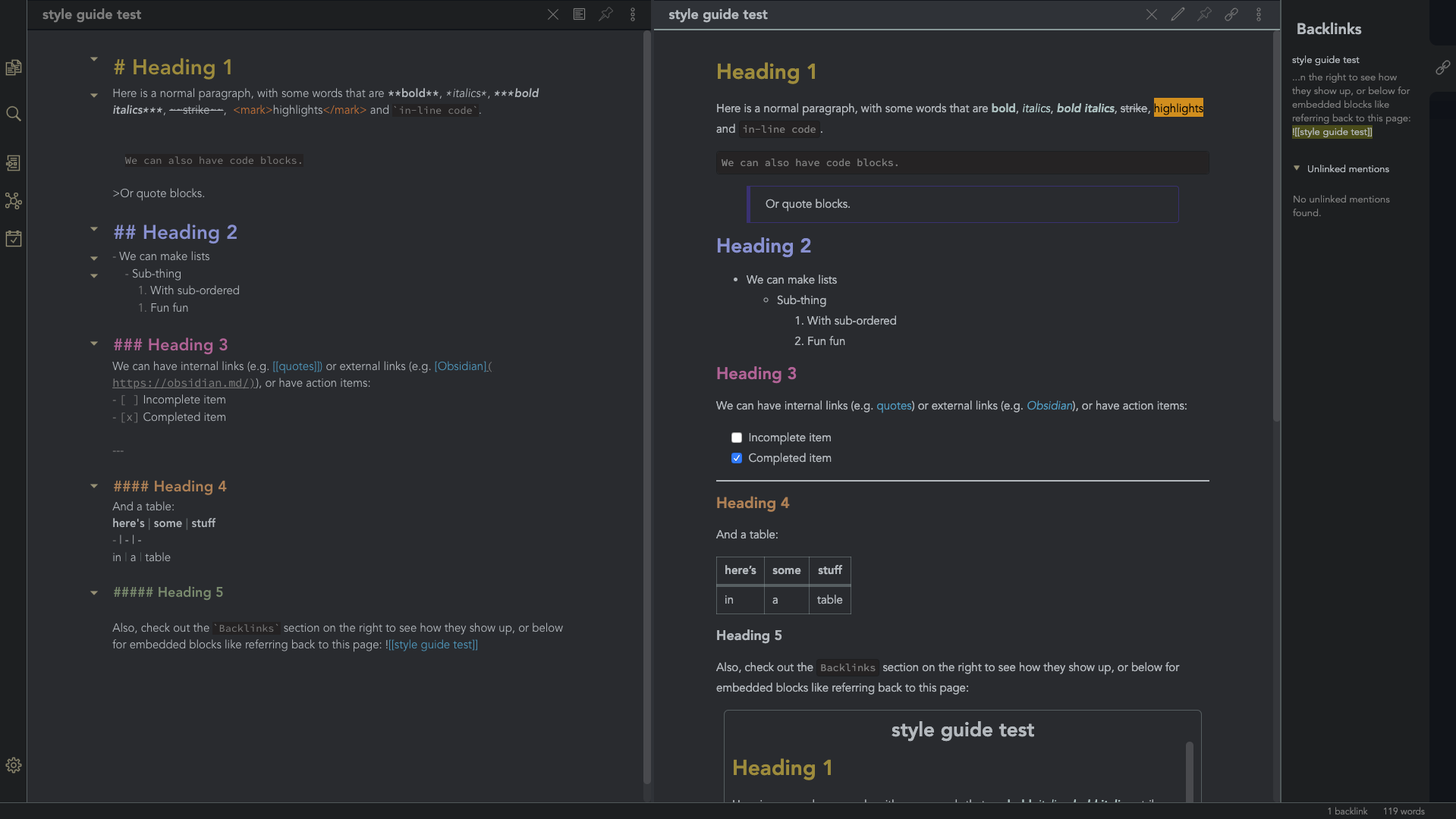 |
obsidian-ezs |
| Gruvbox Theme | This is a gruvbox theme for Obsidian. It supports both light and dark modes. |  |
insanum |
| Gastown | A light theme for Obsidian. |  |
dogwaddle |
| Ursa | A light and dark theme for Obsidian featuring "zen mode" with collapsing side panels and improved single pane viewing. |  |
obsidian-ezs |
| Obsidian Solarized | This is just a recolor based on the solarized color scheme. | 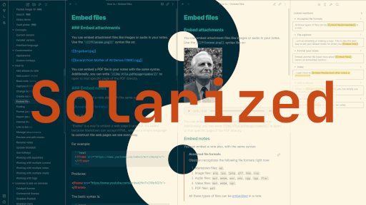 |
Slowbad |
| Red Graphite | A light theme for Obsidian, based on Bear.app's Red Graphite theme. |  |
seanwcom |
| Obsidian + Nord | A Nord-based theme for Obsidian, only supporting dark mode |  |
insanum |
| Illusion Theme | A light theme for Obsidian. The theme is comfortable to the eye everything is a bit bigger and contrasted, combining dark & light themes gave it a unique touch. |  |
Zaher Al Majed |
| Horizon | Dark theme for Obsidian, inspired by the similarly named theme for VSCode. Compatible with Obsidian Desktop, Mobile, and Publish. | 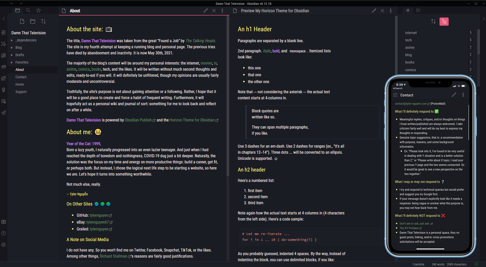 |
Tyler Nguyen |
| Behave dark | A port of the eye friendly Behave theme by Christian Petersen, available for VSCode, FreeCAD, KiCAD, and now Obsidian! |
 |
Chrismettal |
CSS Snippets
Small tweaks to add to your vault/.obsidian/snippets folder.
- Andy Matuschak mode
- Collapsing sidebar
- Bullet point relationship lines
- Task List Preview relationship line Correction
- Auto-fading UI
- Hyphenation and Justification
- Enlarge Image on Hover
- Nicer Check Boxes
- Stylish Block Quotes
- Bigger Link Popup Preview
- Custom icons differing files and folders
- Tag Pills
- Outliner For The Outline and File Explorer
- Make subtler folding gutter arrows
- Better bullet points in edit mode
- Bigger popup windows
- Image cards
Not enough? There are many other places related to snippets:
Andy Matuschak mode
CSS
/* everything under .mod-root now. Don't want Andy messing with sidebars */
/* also, Andy only makes sense for vertical splits, at the root level, right? */
.mod-root.workspace-split.mod-vertical {
  overflow-x:auto;
  --header-width: 36px; /* <- 36px is the header height in the default theme */
}
.mod-root.workspace-split.mod-vertical > div {
  min-width: calc(700px + var(--header-width)); /* <-- 700px is the default theme's "readable" max-width */
  box-shadow: 0px 0px 20px 20px rgba(0,0,0,0.25);
  position:sticky;
  left:0;
}
/* shift sticky position, so titles will stack up to the left /
/ This will currently stack to a maximum of 10 before resetting */
.mod-root.workspace-split.mod-vertical > div:nth-child(10n-8) { left: calc(var(--header-width) * 0); }
.mod-root.workspace-split.mod-vertical > div:nth-child(10n-7) { left: calc(var(--header-width) * 1); }
.mod-root.workspace-split.mod-vertical > div:nth-child(10n-6) { left: calc(var(--header-width) * 2); }
.mod-root.workspace-split.mod-vertical > div:nth-child(10n-5) { left: calc(var(--header-width) * 3); }
.mod-root.workspace-split.mod-vertical > div:nth-child(10n-4) { left: calc(var(--header-width) * 4); }
.mod-root.workspace-split.mod-vertical > div:nth-child(10n-3) { left: calc(var(--header-width) * 5); }
.mod-root.workspace-split.mod-vertical > div:nth-child(10n-2) { left: calc(var(--header-width) * 6); }
.mod-root.workspace-split.mod-vertical > div:nth-child(10n-1) { left: calc(var(--header-width) * 7); }
.mod-root.workspace-split.mod-vertical > div:nth-child(10n+0) { left: calc(var(--header-width) * 8); }
.mod-root.workspace-split.mod-vertical > div:nth-child(10n+1) { left: calc(var(--header-width) * 9); }
/* now it's time for the fancy vertical titles */
/* first we'll add a bit of gap for the title to sit inside of */
.workspace-leaf-content {
padding-left: var(--header-width);
position: relative;
}
/* this is where the magic happens */
.view-header {
writing-mode: vertical-lr;
border-right: 1px solid var(--background-secondary-alt);
border-left: 2px solid var(--background-secondary-alt);
border-top: none;
border-bottom: none;
height: auto;
width: var(--header-width);
position: absolute;
left:0;
top:0;
bottom:0;
}
/* active titles have different border colours */
.workspace-leaf.mod-active .view-header {
border-right: 2px solid var(--interactive-accent);
border-bottom: none;
}
/* unset the title container height and swap padding */
.view-header-title-container {
height: unset;
padding-left: unset;
padding-top: 5px;
}
/* fix the long-title-obscuring shadows */
.view-header-title-container:after {
width: 100%;
height: 30px;
top:unset;
bottom: 0;
background: linear-gradient(to bottom, transparent, var(--background-secondary));
}
.workspace-leaf.mod-active .view-header-title-container:after {
background: linear-gradient(to bottom, transparent, var(--background-primary-alt));
}
/* swap the padding/margin around for the header and actions icons */
.view-header-icon, .view-actions {
padding: 10px 5px;
}
.view-action {
margin: 8px 0;
}
/* get rid of the gap left by the now-missing horizontal title */
.view-content {
height: 100%;
}
/* make the fake drop target overlay have a background so you can see it. /
/ TODO: figure out how the fake target overlay works so we can put the title back, too */
.workspace-fake-target-overlay {
background-color: var(--background-primary);
}
Credits to deathau
Collapsing sidebar
CSS
.side-dock-ribbon.mod-left.is-collapsed:not(:hover), .side-dock-ribbon.mod-right.is-collapsed:not(:hover) {
  width: 15px !important;
  opacity: 0;
}
.side-dock-ribbon {
  transition-property: width, opacity;
}
Credits to kmaasrud
Bullet point relationship lines
CSS
.cm-hmd-list-indent .cm-tab, ul ul { position: relative; }
.cm-hmd-list-indent .cm-tab::before, ul ul::before {
 content:'';
 border-left: 1px solid rgba(0, 122, 255, 0.25);
 position: absolute;
}
.cm-hmd-list-indent .cm-tab::before { left: 0; top: -5px; bottom: -4px;
}
ul ul::before { left: -11px; top: 0; bottom: 0;
}
Credits to deathau
Task List Preview relationship line Correction
CSS
.contains-task-list::before {
  left: 10px ;
}
Credits to d00b
Auto-fading UI
Auto-fading note controls
.view-header:not(:hover) .view-actions {
  opacity: 0.1;
  transition: opacity .25s ease-in-out;
}
Auto-fading status bar
.status-bar:not(:hover) .status-bar-item {
  opacity: 0.25;
  transition: opacity .25s ease-in-out;
}
Subtler folding gutter arrows
.CodeMirror-foldgutter-folded:after,
.CodeMirror-foldgutter-open:after {
  opacity: 0.5;
  font-size: 60%;
}
.CodeMirror-foldgutter-folded:hover:after,
.CodeMirror-foldgutter-open:hover:after {
opacity: 1;
}
.CodeMirror-foldgutter-folded:after {
content: "\25BA";
}
.CodeMirror-foldgutter-open:after {
content: "\25BC";
}
Credits to Rumen Dimitrov
Hyphenation and Justification
CSS
.cm-s-obsidian,
.markdown-preview-view {
  text-align: justify;
  hyphens: auto;
}
Credits to Boyd
Enlarge Image on Hover
CSS
.markdown-preview-view img {
  display: block;
  margin-top: 20pt;
  margin-bottom: 20pt;
  margin-left: auto;
  margin-right: auto;
  width: 50%; /* experiment with values */
  transition: transform 0.25s ease;
}
.markdown-preview-view img:hover {
-webkit-transform: scale(1.8); /* experiment with values */
transform: scale(2);
}
Credits to Den
Nicer Check Boxes
CSS
/* Round checkbxes in preview and editor */
input[type=checkbox], .cm-formatting-task {
    -webkit-appearance: none;
    appearance: none;
    border-radius: 50%;
    border: 1px solid var(--text-faint);
    padding: 0;
    vertical-align: middle;
}
.cm-s-obsidian span.cm-formatting-task {
color: transparent;
width: 1.25em !important;
height: 1.25em;
display: inline-block;
}
input[type=checkbox]:focus{
outline:0;
}
input[type=checkbox]:checked, .cm-formatting-task.cm-property {
background-color: var(--text-accent-hover);
border: 1px solid var(--text-accent-hover);
background-position: center;
background-size: 70%;
background-repeat: no-repeat;
background-image: url('data:image/svg+xml; utf8, ');
}
Credits to Kepano
Stylish Block Quotes
CSS
blockquote:before {
  font: 14px/20px italic Times, serif;
  content: "“";
  font-size: 3em;
  line-height: 0.1em;
  vertical-align: -0.4em;
}
blockquote p {
  display: inline;
}
/* Remove blockquote left margin */
blockquote {
  margin-inline-start: 0;
}
Credits to Théry Fouchter
Bigger Link Popup Preview
CSS
/*============ bigger link popup preview ================*/
.popover.hover-popover {
    transform: scale(0.8); /* makes the content smaller */
    max-height: 800px;    /* was 300 */
    min-height: 100px;
    width: 500px;     /* was 400 */
}
Credits to Cannibalox
Custom icons differing files and folders
CSS
/* Emoji */
/*.nav-file-title-content::before { content: '🗒 '; }
.nav-folder-title-content::before { content: '📂 '; }*/
/* Flat font /
/ Requires: https://icomoon.io/#icons-icomoon/liga-font */
.nav-folder-children .nav-file-title-content:first-child::before {
content: "\e924  ";
font-family: "IcoMoon-Free";
}
.nav-folder-children .nav-folder-title-content::before {
content: "\e930  ";
font-family: "IcoMoon-Free";
}
Credits to deathau
Tag Pills
CSS
/* ====== Tag Pills ======== */
.tag:not(.token) {
	background-color: var(--text-accent);
	border: none;
	color: white;
	font-size: 11px;
	padding: 1px 8px;
	text-align: center;
	text-decoration: none;
	display: inline-block;
	margin: 0px 0px;
	cursor: pointer;
	border-radius: 14px;
}
.tag:not(.token):hover {
	color: white;
	background-color: var(--text-accent-hover);
}
.tag[href^="#obsidian"] {
	background-color: #4d3ca6;
}
.tag[href^="#important"] {
	background-color: red;
}
.tag[href^="#complete"] {
	background-color: green;
}
.tag[href^="#inprogress"] {
	background-color: orange;
}
Credits to uzerper
Outliner For The Outline and File Explorer
CSS
.outline .collapsible-item-children {
  margin-left: 20px;
  border-left: 1px solid var(--faded-aqua);
  border-radius: 4px;
  transition:all 0.5s ease-in-out;
}
.outline .collapsible-item-children:hover {
  border-left-color: var(--faded-aqua);
}
.nav-folder-children .nav-folder-children {
  margin-left: 20px;
  padding-left: 0;
  border-left: 1px solid var(--faded-aqua);
  border-radius: 4px;
  transition:all 0.5s ease-in-out;
}
.nav-folder-children .nav-folder-children:hover {
  border-left-color: var(--faded-aqua);
}
Credits to Shamama and Wonton
Make subtler folding gutter arrows
CSS
.CodeMirror-foldgutter-folded:after,
.CodeMirror-foldgutter-open:after {
  opacity: 0.5;
  font-size: 60%;
}
.CodeMirror-foldgutter-folded:hover:after,
.CodeMirror-foldgutter-open:hover:after {
opacity: 1;
}
.CodeMirror-foldgutter-folded:after {
content: "\25BA";
}
.CodeMirror-foldgutter-open:after {
content: "\25BC";
}
Credits to rsdimitrov
Better bullet points in edit mode
CSS
div:not(.CodeMirror-activeline)>.CodeMirror-line span.cm-formatting-list-ul {
color: transparent;
position: relative;
}
div:not(.CodeMirror-activeline)>.CodeMirror-line span.cm-formatting-list-ul:after {
content: "•";
position: absolute;
top: -6px;
left: 4px;
color: var(--bright-aqua);
font-family: sans-serif;
font-size: 20px;
}
Credits to Piotr
Bigger popup windows
CSS
.popover.hover-popover {
transform: scale(0.8); /* makes the content smaller /
max-height: 800px;
min-height: 50px;
width: 500px;
overflow: overlay; / new added */
}
.popover.hover-popover .markdown-embed  {
height: 100%;
}
.popover.hover-popover.is-loaded .markdown-embed .markdown-embed-content .markdown-preview-view{
padding: 10px 10px 10px 16px; /*16px  two pop magin */
}
Credits to Echo
Image cards
CSS
img {
border-radius: 4px;
box-shadow: 0 1px 3px rgba(0, 0, 0, 0.12), 0 1px 2px rgba(0, 0, 0, 0.24);
background-color: var(--background-secondary); /* Background color so PNGs with transparent backgrounds don't look weird */
}
Credits to TClark1011