mirror of
https://github.com/go-vikunja/vikunja.git
synced 2026-07-15 22:32:29 -05:00
"Save" copy instead of "Done" for Description #12
Closed
opened 2025-11-01 20:44:00 -05:00 by GiteaMirror
·
3 comments
No Branch/Tag Specified
main
renovate/major-dev-dependencies
renovate/postcss-8.x
fix-subtask-root-null-safety
renovate/crowdin-github-action-2.x
renovate/postgres-18
renovate/actions-setup-node-6.x
renovate/github.com-labstack-echo-v5-5.x
renovate/tar-7.x
renovate/pnpm
claude/task-event-field-changes-ws73g2
renovate/github.com-labstack-echo-jwt-v5-5.x
renovate/marked-18.x
pr-swarm-assets
feat-mcp
feat-audit-sinks
claude/per-user-feature-toggles-vqlg8x
docs-v2-query-param
feat-project-templates
claude/veans-question-xBFkq
spike-huma-openapi3
claude/investigate-swagger3-support-nyyUa
feat-list-view-buckets
ci-mysql-8-test
codex/analyze-codebase-for-email-task-feature
csv-import-feature
claude/email-reply-comments-wpdcQ
fix-oidc-pkce-support
fix/overview-subtasks-expand
feat/bucket-select-task-detail
feat-soft-delete-projects
claude/review-bot-design-plan-cf5C3
claude/project-scoped-api-tokens-KTqR3
claude/explore-openclaw-integration-KQEzg
claude/project-scoped-api-tokens-yv5KS
fix-duplicate-close-button
feat-list-view-sorting
feat/official-vite-sentry-plugin
feat/highlight-overdue-tasks
feat/add-enter-key-form-submission-handling
feat/TipTap-nits
feat/update-caldavtimetotimestamp-parsing
feat-phosphor-icons
wip-plans
claude/investigate-issue-2173-llKme
fix-description-text-drag
feat-custom-keyboard-shortcuts
pr-1845-ci
codex/fix-drag-and-drop-behavior-inconsistency
copilot/add-clickable-labels-for-filtering
copilot/fix-issue-1786
playwright-migration
fix-kanban-repeating-wip
copilot/fix-1498
feature/replace-axios
codex/upgrade-to-tailwind-4.1.8-using-pnpm
codex/add-cypress-test-for-avatar-types
feature/biome
feature/oxc
codex/update-flexsearch-to-0.8.205
4r6ni9-codex/fix-deprecated-sass-@import-usage
codex/fix-deprecated-sass-@import-usage
codex/add-cypress-test-for-task-list-refresh-fix
codex/fix-quick-add-magic-not-adding-tasks
codex/fix-all-type-errors
codex/fix-mimetype-for-docs.json
feature/caldav-from-scratch
feature/gh-actions-hetzner
fix-ci
feat/new-logger
jyte-better-dev-config
feat/add-team-member-with-enter
fix/button-and-icon-types
fix/notifications-component-name-collision
feature/null-time
renovate/tailwindcss-4.x
feature/unplugin-vue-router
fix/deprecated-import
feature/zod-schema
renovate/golangci-golangci-lint-1.x
fix/tiptap-editor-reactive-destructuring
release/0.24
feat/improve-add-task
fix/saved-filter-search
feat/webp-and-avif-attachment-previews
feature/migrate-back-to-bulma
fix/sass-add-missing-list-import
feature/sticky-demo-bar
fix/gantt-view-switch
feature/typesense-position-join
feature/focus-visible
dependencies/golangci-lint
feature/better-filter-syntax
fix/tiptap-task-list
renovate/github.com-golang-jwt-jwt-v4-5.x
feature/hide-forbidden-related-tasks
renovate/golang-1.x
release/0.20
release/0.17
release/0.16
release/0.15
release/0.14
v2.3.0
v2.2.2
v2.2.1
v2.2.0
v2.1.0
v2.0.0
v1.1.0
v1.0.0
v1.0.0-rc4
v1.0.0-rc3
v1.0.0-rc2
v1.0.0-rc1
v1.0.0-rc0
v0.24.6
v0.24.5
v0.24.4
v0.24.3
v0.24.2
v0.24.1
v0.24.0
v0.23.0
v0.22.1
v0.22.0
0.21.0
v0.21.0
v0.20.4
v0.20.5
v0.20.3
v0.20.2
v0.20.1
v0.20.0
v0.19.2
v0.19.1
v0.19.0
vue3
v0.18.1
v0.18.0
v0.17.1
v0.17.0
v0.16.1
v0.16.0
v0.15.1
v0.15.0
v0.14.1
v0.14.0
v0.13.1
v0.13
v0.12
v0.11
v0.10
v0.9
v0.8
v0.7
v0.6
v0.5
v0.4
v0.3
v0.2
v0.1
Labels
Clear labels
area/api
area/attachments
area/auth
area/avatars
area/backup-restore
area/caldav
area/calendar-view
area/comments
area/config
area/database
area/desktop
area/docker
area/email
area/favorites
area/filters
area/frontend
area/gantt
area/i18n
area/import-export
area/internal-code
area/kanban
area/labels
area/list-view
area/mobile
area/notifications
area/permissions
area/projects
area/pwa
area/recurring-tasks
area/reminders
area/search
area/shortcuts
area/subtasks
area/sync
area/table-view
area/task-editor
area/task-metadata
area/task-relations
area/teams
area/theming
area/time-tracking
area/typesense
area/views
area/webhooks
bug
changes requested
concern/accessibility
concern/performance
concern/regression
concern/ux
confirmed
db/mysql
dependencies
enhancement
good first issue
help wanted
integration/inbound
integration/outbound
kind/bug
kind/feature
needs reproduction
pull-request
question
security
support
upstream issue
waiting for reply
wontfix
Mirrored from GitHub Pull Request
No Label
Milestone
No items
No Milestone
Projects
Clear projects
No project
No Assignees
Notifications
Due Date
No due date set.
Dependencies
No dependencies set.
Reference: github-starred/vikunja#12
Reference in New Issue
Block a user
Blocking a user prevents them from interacting with repositories, such as opening or commenting on pull requests or issues. Learn more about blocking a user.
Delete Branch "%!s()"
Deleting a branch is permanent. Although the deleted branch may continue to exist for a short time before it actually gets removed, it CANNOT be undone in most cases. Continue?
Originally created by @jbd7 on GitHub (Aug 18, 2021).
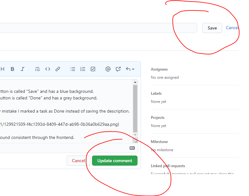
Hey, I noticed a minor UX inconsistency today:
There's also proximity with the green "Done" status button. By mistake I marked a task as Done instead of saving the description.
Suggestion: Keep the copy "Save" and the blue button background consistent through the frontend.
@kolaente commented on GitHub (Aug 18, 2021):
There's been a bit of discussion about that lately: https://kolaente.dev/vikunja/frontend/issues/652
In comparison to the save button on the quick edit this one only saves the description whereas the done button only saves the description. In the latest unstable version the done button has been moved below the text, similar to the way it is solved in comments. Please check it out on try, what do you think?
@jbd7 commented on GitHub (Aug 18, 2021):
Thanks, I didn't see that. Btw, do you prefer threads on koalente.dev instead of github?
From the screenshots there the placement does look better. It'd indeed make sense to keep consistency with the "COMMENT" button just blow. When it comes to the copy, I think "Edit"/"Save" or "Edit"/"Update" is more common and understood than < Pencil-icon >/"Finish", taking as an example this very github page :)
@kolaente commented on GitHub (Aug 18, 2021):
Threads on Gitea or here are both fine for me. The majority of the active development happens the Gitea instance though.
I agree with you about the wording, will put something up.