mirror of
https://github.com/conventional-commits/conventionalcommits.org.git
synced 2026-03-22 12:44:37 -05:00
Revamp website with new UI #40
No Assignees
Notifications
Due Date
No due date set.
Dependencies
No dependencies set.
Reference: github-starred/conventionalcommits.org#40
Reference in New Issue
Block a user
Delete Branch "%!s()"
Deleting a branch is permanent. Although the deleted branch may continue to exist for a short time before it actually gets removed, it CANNOT be undone in most cases. Continue?
Originally created by @damianopetrungaro on GitHub (Aug 20, 2018).
Originally assigned to: @zeke, @jameswomack, @nexdrew, @stevemao, @hutson on GitHub.
What do you think about revamping the UI of the website with a new theme (and\or new tool for generating the static website)?
We can make it as cool as keep a changelog so that more people will read it because it looks good
@damianopetrungaro commented on GitHub (Aug 20, 2018):
Looking for sth like this: https://themes.gohugo.io/theme/hugo-icon/
@hutson commented on GitHub (Aug 20, 2018):
I have no particular preference for a theme, though I am fine with y'all going with a new theme.
My only request is that the following be taken into consideration:
@damianopetrungaro commented on GitHub (Aug 20, 2018):
Yeah sure, I was thinking to use
hugobecause it has more themes (and it's also faster to compile and reload changes, but this is not a big deal for this project).Feel free to suggest any theme for any tool you like and of course match what @hbetts recommend.
@damianopetrungaro commented on GitHub (Aug 20, 2018):
Generated using a file like this
Powered by Hugo and hugo-theme-sarah
Of course, I still need to change some colors, links add images etc. etc. but this one looks better IMHO.
Let me know about it ;)
@hutson commented on GitHub (Aug 21, 2018):
It looks fine to me.
@damianopetrungaro commented on GitHub (Aug 21, 2018):
Please, @conventional-commits/committee give me a feedback so I will put some effort if all of you are fine with it ;)
@damianopetrungaro commented on GitHub (Aug 21, 2018):
I got some free time at home and i designed those two things.
If we are going to implement a custom design we need someonw who will write HTML and CSS ( i never wrote it so i need external help)
Feedbacks appriciated:
@hutson commented on GitHub (Aug 21, 2018):
For that reason I would prefer if we limited how much customization we do. Unless we can find two or more people that are able and willing to dedicate the time to being our HTML/CSS contributors.
As for the designs in your latest commit, I think they look great. My only suggestion would be to increase the font size so that the text is easier to read.
@damianopetrungaro commented on GitHub (Aug 21, 2018):
Already done ;)
This will be one very simple page so the effort won't be huge.
If someone is free to spend some time coding it would be great!
@damianopetrungaro commented on GitHub (Aug 21, 2018):
Found someone who has some free time next week!
@lorenzodianni is the best js developer I have ever known and he uses the conventional commits for months!
He'd be happy to take care of the HTML/CSS page.
And it would be great also having your feedback about the design and the project itself!
@zeke commented on GitHub (Aug 21, 2018):
Wow really cool to see this design work, @damianopetrungaro 🎨
I haven't used hugo, though I know it's popular and active. I wouldn't be opposed to this if you want to take the initiative, @damianopetrungaro 👍
That said, when pondering how I personally would revamp the existing site, I imagined using Node.js (rather than Ruby or Go) and a set of of "small sharp modules" like:
The above tools could be used to generate a static site and/or a dynamic server-rendered site.
@damianopetrungaro commented on GitHub (Aug 21, 2018):
I chose Hugo for the great doc and the super active support.
https://ghub.io/hubdown to convert markdown into GitHub-style HTML
https://ghub.io/github-markdown-css to style that HTML
https://ghub.io/nanohtml to wrap pages in a layout.
The above tools could be used to generate a static site and/or a dynamic server-rendered site.
@bcoe commented on GitHub (Aug 22, 2018):
@zeke @damianopetrungaro I like the direction we're going in, but I don't love that I need to click a button to start reading the spec, it seems like the page you land on is a bit barren.
Maybe the tldr; description of the specification could be above the fold, and then we dig into it deeper as you scroll down the page.
With this new design, the actual specification itself will still be in markdown?
@damianopetrungaro commented on GitHub (Aug 22, 2018):
@bcoe the idea is to scroll and read the spec, what I posted is just the first section the users will see.
It depends if we wanna change it, I already linked an example of how the doc could be changed so.
But if we don't want to move from markdown, we won't.
The new design will just be a UI improvement.
@zeke commented on GitHub (Aug 22, 2018):
Yes please! The layout and design should be kept separate from the spec, for ease of editing, portability, and translatability.
@damianopetrungaro commented on GitHub (Aug 22, 2018):
Yup, this is what exactly I am working on 😄
@damianopetrungaro commented on GitHub (Aug 22, 2018):
@zeke I've done a small test on how it may look like.
https://github.com/damianopetrungaro/_hugotest
https://github.com/damianopetrungaro/_hugotest/blob/master/content/beta0.0.3/index.md
Quick explanation:
{{< welcome >}}will load the first section (the one with the nice UI linked ⬆️ )
{{% white-partial %}}...{{% white-partial %}}will inject the markdown defined in the two shortcodes in some HTML defined in the theme (see here)
We may also avoid using the
white-partialandcolor-partialusing some CSS.But I am not a FE developer, so in the doubt, I've put it there, I am quite sure @lorenzodianni will help us to remove those two elements too 😄
@damianopetrungaro commented on GitHub (Aug 26, 2018):
Conventional Commits.pdf
There are missing only the images/icons/sth to put in the middle of the page.
This is a good version of the UI.
Differences between link size will be fixed on code side.
Please send all of your opinions and which color you do prefer!
@damianopetrungaro commented on GitHub (Aug 26, 2018):
btw, we may also use the simple logo I put on the PDF as main one, is super simple and imho represent the pureness of a clean conventional commit
@hutson commented on GitHub (Aug 26, 2018):
Purely my two cents based on my aesthetics preferences:
@damianopetrungaro commented on GitHub (Aug 26, 2018):
@damianopetrungaro commented on GitHub (Aug 27, 2018):
If no one has nothing to add on this I'll ask to @lorenzodianni to start working on CSS and HTML
@bcoe commented on GitHub (Aug 27, 2018):
@damianopetrungaro I'm really happy with how this is looking.
@lorenzodianni commented on GitHub (Aug 27, 2018):
Hi to everyone!
@damianopetrungaro send me all info about the new style, i'll work on it asap! 🕺
@damianopetrungaro commented on GitHub (Aug 27, 2018):
Sure 💪
@damianopetrungaro commented on GitHub (Sep 4, 2018):
Thanks to the great effort and the great work that @lorenzodianni put into it, we are proud to announce the first demo of the UI revamp!
https://conventional-commits-test.netlify.com/en/v1.0.0-beta.2/
@hbetts @zeke @bcoe
There are still a couple of things to optimize (like the redirects and the anchor link to the specs), but this will be super close to the final version!
Any feedback is welcome!
Code here https://github.com/damianopetrungaro/_hugotest
@damianopetrungaro commented on GitHub (Sep 4, 2018):
FYI:
We'll have for free (0 configurations and 0$) CD on Pull Request thanks to netlify
I asked them if we may also have a free pro account so that it will not belong only to me but to all the admins 😄
I'll keep you updated 😄
@hutson commented on GitHub (Sep 4, 2018):
Three things I came across:
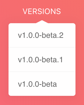
First, the drop-down for Versions is really difficult for me to use. Hovering over a version for more than a second causes the menu to vanish. (Using latest Firefox)
Second, the title looks cutoff for the specification:
^ That's what I see at the very bottom of my screen when I first load the page.
Instead of just saying GitHub, I feel like changing it to Contribute may help encourage our community to take a more active role in the development of this specification.
@hutson commented on GitHub (Sep 4, 2018):
It should be said, though, that I really do like the website. Contrast feels pretty good. It's easy to scroll through and find content. Branding is really starting to take shape.
👍
@damianopetrungaro commented on GitHub (Sep 4, 2018):
Sure!
@lorenzodianni let's fix that https://github.com/conventional-commits/conventionalcommits.org/issues/81#issuecomment-418383793
@damianopetrungaro commented on GitHub (Sep 4, 2018):
@hbetts i am not a frontend dev, but doesn't the content shown at the very bottom of the screen when the page is loaded depends on the screen size?
@bcoe commented on GitHub (Sep 4, 2018):
@damianopetrungaro this is looking really good 👍 a couple minor nits:
the drop down menu for versions feels a little disjoint from what it's dropping down from, I think an arrow pointing towards the link it's dropping down from could help with this, like this:
clicking the "Read the Specs" link didn't do anything.
we need to word smith a better introduction sentence, off the top of my head:
☝️ this is pretty clunky, but I think a paragraph that calls out some of the reasons why I'd benefit from writing conventional commit messages would be good.
@damianopetrungaro commented on GitHub (Sep 5, 2018):
@bcoe
Do you think adding an arrow would be better?
We can try to add it and see how it looks.
About the second point is sth that will be fixed when migrating properly, this is just a test, and as I said it's sth we need to add.
about this:
For me it's fine, but it needs to be short, there's already a summary section we don't need t to create it also there 😄
@damianopetrungaro commented on GitHub (Sep 5, 2018):
I am also super proud to announce that netlify gave us a special pro plan for free!
We'll be able to add more than collaborators to our team, and enjoy a free CD for each new PR and branch!
I'd like to add them in the README when the new UI we'll go live!
@conventional-commits/committee Please send me your email in the private team and I'll add you on the netlify platform!
@lorenzodianni commented on GitHub (Sep 5, 2018):
@bcoe what do you think about this arrow?
@hbetts about specification title:
the gradient section has always 100% viewport height and the article section has a negative translationY (so the article moves up).
Do you think it's better to move it higher or to move it under the gradient section? (we will see the article only after scroll)
@damianopetrungaro commented on GitHub (Sep 5, 2018):
@lorenzodianni IMHO see the article only after scrolling is the best solution (maybe it looks better too)
@hutson commented on GitHub (Sep 5, 2018):
Thank you for the explanation! 👍
That's a really tough one.
I moved the content up using -95px and it feels like it's crowding the content on the splash page. Also, it seems a little redundant (The title of the splash page, and the title of the article both say Conventional Commits).
Moving the content down looks nicer, but it's not apparent that you can scroll down to read additional content.
Any thoughts on that later point?
@damianopetrungaro commented on GitHub (Sep 11, 2018):
All the changes have been applied.
See that I have no more feedbacks I'll open a PR today, and pair with @bcoe to transfer the domain to Netlify.
fyi: offical version